
The fundamentals of a good dental website hold everywhere: earn trust, be clear, make booking easy. But the right emphasis depends on who the practice serves. A family practice and an emergency practice are trying to reach very different patients, in very different moments, and their websites should reflect that. A site built for one, dropped onto the other, rarely fits.
Here is what each one needs most.
Family practices: welcoming to everyone
A family practice serves the whole spectrum, from a frightened four-year-old at their very first visit to a grandparent who has not seen a dentist in years. Its website has to feel welcoming to all of them at once, which is a real design challenge.
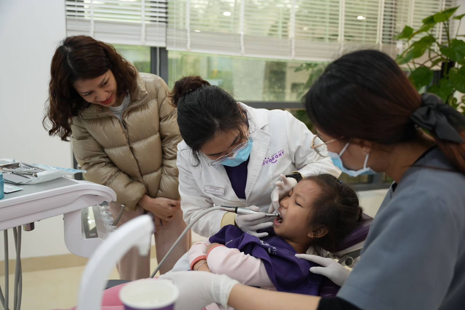
It starts with warmth. Real images of your team with patients of every age, a friendly and unintimidating tone, and a sense that this is a comfortable, unhurried place all help a family feel they belong. A parent choosing a dentist for their children is looking for reassurance above everything, that their kids will be treated gently and made to feel safe. A site that radiates that warmth wins those parents. A cold, clinical one sends them looking elsewhere.
Breadth matters too. A family practice offers a wide range of care, and its site should make that easy to navigate, so a visitor can quickly see whether you handle what they need, from routine cleanings to a child's first checkup to care for an aging parent. Presenting that breadth clearly, without overwhelming the visitor, is the balance to strike.
And because families juggle busy, complicated schedules, easy booking and simple communication carry extra weight. A parent coordinating appointments for three children will quietly love the practice that makes scheduling painless, and remember the one that made it a chore. There is a subtlety worth noting for family practices: the site often has to win over two people at once. The parent is the decision-maker, choosing a practice they trust with their children. But the child's comfort matters too, and a site that feels friendly and unintimidating helps a nervous parent imagine their child actually being okay there. Warmth, real faces, and a gentle tone do double duty, reassuring the parent and, indirectly, the child. A family site that feels cold or purely clinical asks a parent to take a leap of faith that a warmer competitor does not.
Emergency practices: help, now
An emergency patient is in a completely different state. They are often in pain, frightened, and in a hurry. They are not browsing, comparing, or reading your team bios. They want one thing: to know that someone can see them now, and how to reach them immediately.
For an emergency practice, the website has to strip everything back to that. The essential information, that you handle emergencies, and exactly how to reach you, should be the first thing a patient sees, impossible to miss, and instantly actionable. A phone number a patient in pain can tap in a single touch matters more than anything else on the page.
Speed is everything here, in two senses. The site itself must load fast, because a patient in pain will not wait for it. And the path to help must be fast, with no hunting, no forms, and no friction between the patient and the phone. Reassurance still helps, a calm, confident tone that says you will be looked after, but only once the immediate path to help is unmistakable. Get the order wrong, and a frightened patient bounces before your reassurance ever reaches them. It helps to remember the state an emergency patient is actually in. They are often in real pain, possibly frightened, and scrolling one-handed on a phone, with little patience for anything that gets in the way. Everything about the site should bend to that reality. The way to reach you should be the most prominent thing on the page, tappable in a single touch. The message that you can help, now, should be unmistakable at a glance. And nothing, not a slow load, not a menu to navigate, not a form to fill, should stand between a person in pain and the help they need.
When a practice is both, or something else
Many practices do not fall neatly into one box. A family practice may also handle emergencies; a general practice may want to grow its cosmetic work. The principle still holds: the site should be built around the patients you actually serve and the ones you most want to attract, with the right emphasis for each. A family practice that also takes emergencies can be warm and welcoming while still making its emergency path clearly and instantly findable for the patient who needs it. A general practice growing its cosmetic side can serve everyday patients while giving real visual weight to the treatments it wants more of. The mistake is not serving more than one kind of patient. The mistake is a generic site that serves none of them with any real focus, because it was built for no one in particular.
The shared foundation
For all their differences, both kinds of practice rest on the same foundation. Both need to earn trust, work flawlessly on a phone, and make the next step effortless. What changes is the emphasis: warmth and breadth for the family practice, speed and immediacy for the emergency one. A site built with the right emphasis for the patient it actually serves will always outperform a generic one that tries to be everything to everyone and ends up being memorable to no one. That is the real takeaway across both kinds of practice, and every kind besides: the site that knows exactly who it is for, and speaks to that person plainly and warmly, will always beat the one that tries to speak to everyone and therefore moves no one in particular.
The cost of a one-size-fits-all site
It is worth being clear about what a generic, unfocused site actually costs, because the loss is invisible. When a family looking for a gentle practice for their kids lands on a site that could belong to any dentist anywhere, they feel no particular pull, and they keep looking. When a patient in pain lands on a site that buries its emergency information among everything else, they give up and call the next practice. Neither of them tells you they left. The practice simply never sees the patients its site quietly turned away. Matching a site to the patient it serves is not a design nicety. It is the difference between a site that converts the right patients and one that lets them slip past, unnoticed, to a competitor who spoke to them directly.
Where to go next
Matching a site to the practice it serves is part of what makes dental website design work. For the full picture, see our guide to dental website design, and read on into designing for patient anxiety, websites for dental specialists, and getting online booking right.
Does your website speak to the specific patient you serve, or to dentistry in general? The difference tends to show.