
Before a patient reads a word about your practice, they feel something. The colours, the imagery, the overall look of your brand set an emotional tone in an instant, and for a dental practice, that tone matters more than almost anywhere else. A great many patients arrive anxious. The look and feel of your brand is the first thing that either calms them or quietly confirms their fear.
Getting this right is not about chasing design trends. It is about making a nervous patient feel, at a glance, that this is a warm and trustworthy place.
The feel is felt, not analyzed
It is worth being clear about how look and feel actually works on a patient, because it is not a conscious process. A patient does not study your colours or evaluate your typography. They simply feel something, warmth or coldness, calm or unease, care or carelessness, in the first instant, faster than thought. That feeling arrives before any words are read, and it colours everything that follows.
This is why look and feel is not decoration or vanity. It is the first and fastest message your practice sends, and for an anxious patient it is often the deciding one. A warm, welcoming feel gives a frightened patient permission to stay and read on. A cold, clinical one confirms the dread they arrived with and sends them away, before your words ever get a chance to reassure them. Getting the feel right is getting the first, wordless impression right, and that impression does more than most practices realize.
Colour, and the feeling it creates
Colour does quiet emotional work. Soft blues and greens feel calm and clean. Warm tones feel friendly and human. Crisp, cool palettes feel precise and expert. There is no single right choice, but there is a right choice for your practice and your patients.
A family practice leans toward warmth and approachability. A cosmetic practice might lean toward something more refined. What matters is that the palette matches the feeling you want a patient to have, and that it stays consistent everywhere they encounter you. The common mistake is a cold, clinical palette that reinforces exactly the sterile, anxious associations many patients already carry about the dentist. It is an understandable mistake, because clinical can feel like a signal of competence and hygiene. But to a nervous patient, a sterile palette reads as the cold, unwelcoming dental experience they are dreading, not as reassurance. Warmth, carefully chosen, conveys both care and competence without triggering the fear, which is why so many of the practices that put patients at ease lean warm rather than clinical.
Imagery, and why real beats perfect
Few things shape the feel of a dental brand more than its images, and few things are more often wrong. Stock photos of strangers with impossibly perfect smiles feel generic and hollow. They tell a patient nothing true, and a nervous patient looking for reassurance senses the emptiness.
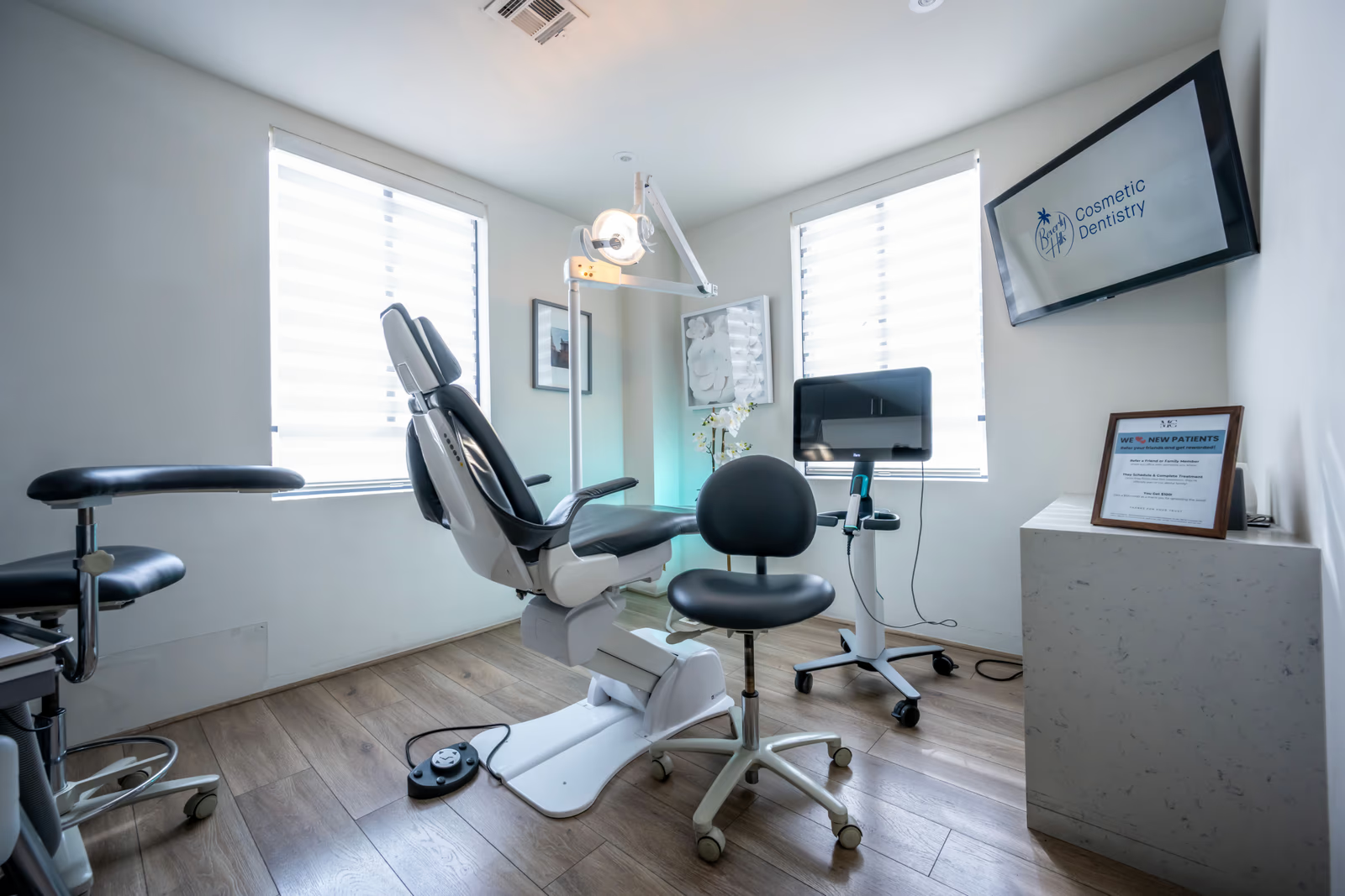
Real photographs of your actual team and your actual space do the opposite. They let a patient see the faces they will meet and the room they will sit in. They make the unknown familiar, which is exactly what an anxious patient needs. Warm, genuine imagery is one of the most powerful trust-building tools a practice has, and it is entirely within reach. There is a deeper reason real imagery works so well for an anxious patient specifically. Their fear thrives on the unknown, on not knowing what the place will be like or who they will face. A genuine photo of the actual reception, the actual room, the actual team, replaces that unknown with something concrete and human. The patient has, in a small way, already been there before they arrive, and that familiarity is quietly calming in a way no stock image can be.
Typography and the overall feel
Even the style of lettering contributes to the feeling. Clean, readable type feels professional and calm. Overly decorative or hard-to-read type creates friction and, at the extreme, distrust. The goal is not to be noticed; it is to feel effortless and clear, part of an overall impression of a practice that has its act together.
The details that shape how a brand feels
Beyond the big elements of colour and imagery, a brand's feel is shaped by details a patient never consciously registers but always senses. The quality of the photographs. The amount of breathing room around things, cramped and cluttered feels stressful, while generous space feels calm and considered. The care evident in small touches, or the lack of it. The overall sense of whether things are polished and intentional or thrown together.
These details are the difference between a brand that feels premium and trustworthy and one that feels amateur, even when both use similar colours and a similar logo. A patient cannot tell you why one practice's site feels reassuring and another's feels off-putting, but they feel it clearly, and they act on it. Sweating these details is not perfectionism. It is the quiet work that makes a brand feel like a practice that will take the same care with them.
Why the feel matters so much in dentistry
Return, as always, to the anxious patient, because they are the reason all of this matters. That patient is not analyzing your design. They are feeling it. A warm, calm, welcoming look lowers their guard and gives them permission to come in. A cold, clinical one raises it. The practices that understand this treat their look and feel not as decoration, but as the first and most immediate way they reassure a frightened patient.
The feel has to hold everywhere
One more thing matters about look and feel: it cannot live only on the website. The feeling a patient gets online sets an expectation, and that expectation has to hold when they encounter the practice everywhere else, the signage, the emails, the waiting room itself. A warm, calm website that leads to a cold, cluttered office breaks the promise the feel made, and a broken promise erodes trust faster than a modest brand ever would.
So the goal is a consistent feel across every place a patient meets the practice, online and off. When the warmth and calm a patient felt on the website is confirmed the moment they walk in, the brand is doing exactly what it should, and trust deepens with every consistent impression. The feel is not a coat of paint on the website. It is the emotional signature of the whole practice, and it works best when it is the same everywhere.
Where to go next
The look and feel of a brand is one part of the whole. For the full picture, see our guide to dental branding and how we approach dental website design and branding, and read on into designing a logo that builds confidence, branding a specialist practice, and keeping a brand consistent.
Think of the last new patient who was visibly nervous. Would the look and feel of your brand have made them feel more at ease, or less?