
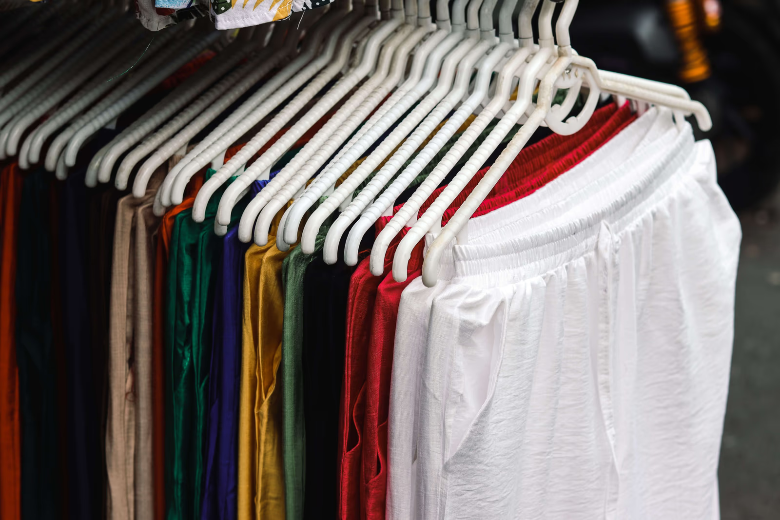
A logo is only part of how a clothing brand is recognized. Far more often, people identify a brand before they see any mark at all, from its colours, its typography, the way its images look, the overall visual world it has built. That visual system is doing constant work: setting expectations about price and quality, signalling who the brand is for, and making it recognizable at a glance in a field where a glance is often all a brand gets. Colour and visual identity are where a fashion brand's character becomes visible. Here is how they work.
What a visual identity includes
A brand's visual identity is the coherent system of visual decisions that express it. The palette is usually the most immediately recognizable part, the colours a brand uses and, just as importantly, the ones it does not. Typography carries an enormous amount of character, since the same words set in different type can read as luxurious, technical, playful, or austere. Imagery style, how garments and people are photographed, styled, and lit, is especially powerful in fashion, where pictures carry most of the communication. And the overall composition and use of space, how open, dense, restrained, or expressive the layouts are, sets a tone before anything is read.
Together these form a visual language. A brand that uses it consistently becomes recognizable through the language alone, which is why a shopper can often identify a brand from a single image with no logo in it. That is the real test of a visual identity, and a useful ambition: not merely to have a logo people recognize, but to build a visual world distinctive enough that the brand is recognizable without one.
What colour does for a clothing brand
Fashion brand colour works faster than words. People register it immediately and respond to it before they have consciously read anything, which makes a brand's palette one of the most efficient signals it has. In fashion, colour choices tend to communicate a few things at once.
They signal the brand's register. Restrained, muted, or monochrome palettes tend to read as considered and premium; bright, saturated, high-contrast palettes read as energetic and accessible. Neither is better, but each sets a different expectation about what kind of brand this is and what it is likely to cost.
They signal who the brand is for. Palettes carry associations with particular aesthetics and audiences, so a palette is part of how a brand indicates, quickly, whether it is meant for a given shopper.
They create recognition. A brand that uses a distinctive, consistent palette becomes identifiable by it, so its images, packaging, and site are recognizable as its own even in passing.
They set the stage for the clothes. This is a fashion-specific consideration that matters more than it might seem. A brand's palette has to work with the garments it sells rather than competing with them, since the clothes are the thing being looked at. This is one reason so many clothing brands settle on restrained brand palettes: they let the products carry the colour. It also means a fashion brand's palette has to accommodate whatever it sells, season after season, so a palette that happens to flatter one collection but clashes with the next is a problem in waiting. The palettes that work tend to be ones that can sit behind a changing range of garments without ever competing with them.
Restraint, and knowing what to leave out
One of the most useful things to understand about a fashion brand's palette is that its power comes as much from exclusion as from selection. A brand that uses a small, disciplined set of colours becomes recognizable through them; a brand that reaches for whatever colour suits each occasion never builds that association, because there is nothing consistent to associate. The colours a brand declines to use are part of what defines it.
This is why strong visual identities tend to be narrower than instinct suggests. It can feel limiting to commit to a small palette, particularly for a brand that wants to feel creative, but the limitation is what produces recognition, and within it there is ample room for expression through imagery, styling, and the garments themselves. Brands that widen their palette to avoid feeling constrained usually find they have traded a recognizable identity for a slightly easier time making individual decisions, which is a poor exchange.
Choosing a palette that lasts
The most common mistakes with fashion brand colour are picking a palette because it is currently fashionable, which dates quickly and is expensive to change, and picking one that fights the product photography it will surround. A palette is worth choosing for how it expresses the brand's actual character and how it will function across everything it touches, the website, packaging, labels, imagery, in both digital and physical form, where colours behave differently.
Practicality matters too. A palette needs enough range to build a usable system, a primary identity, supporting tones, and neutrals, and it needs to meet accessibility requirements for readable contrast, which is both a legal expectation in many markets and simply necessary if people are to read the site. A beautiful palette that produces unreadable text is not a workable identity. Colours also behave differently across the media a clothing brand uses, and this catches brands out regularly: a colour that looks right on a screen may print differently on packaging, dye differently on fabric, or shift under shop lighting, so a palette worth committing to is one that has been considered in the physical forms it will actually take, not only the digital ones.
Typography and imagery, the quieter half
Colour gets the attention, but typography and imagery often do more to define a fashion brand's character. Typography is the voice of a brand made visible, and a consistent, well-chosen typeface carries character through every piece of writing a brand produces. Imagery style is arguably the single most defining element of a fashion brand's visual identity, since a brand's photographs, how they are styled, cast, composed, and lit, communicate its world more completely than any other element. Two brands can share a palette and still feel entirely different because their pictures do. This is where a smaller brand can most readily distinguish itself, since a distinctive, consistent approach to imagery is a matter of judgment and direction rather than budget, and it is noticed immediately by exactly the shoppers a brand most wants.
A visual identity is strongest when all of these agree: the palette, the type, the imagery, and the composition expressing one coherent character rather than pulling in different directions. That coherence is what makes a brand feel considered, and considered is much of what people are buying when they choose one clothing brand over another.
Where to go next
Colour, type, and imagery are how a clothing brand becomes recognizable before anyone reads a word. For the full picture, see our guide to fashion branding and how we approach clothing brand design and websites, and read on into designing a fashion logo that sticks, telling your clothing brand's story, and building a fashion brand that feels cohesive everywhere.
Could someone recognize one of your brand's images as yours with the logo removed, or would it look like it could have come from any label selling similar clothes?