
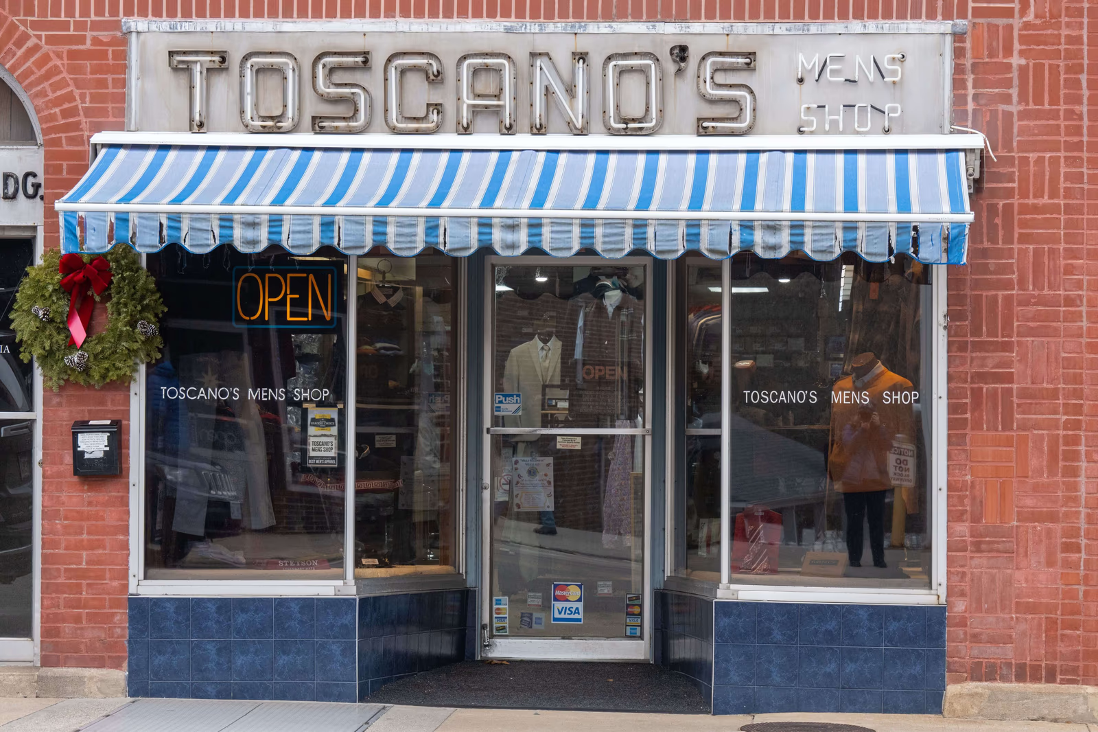
A clothing brand's logo does more work than almost any other single element of its identity. It appears on labels and packaging, on the website and the phone screen, on social profiles, sometimes on the garments themselves and on a shopfront, and in every one of those places it has to be recognizable, legible, and unmistakably the brand. A logo that sticks becomes shorthand for everything the brand means; one that does not is simply decoration people forget. Fashion logo design is the craft of creating a mark that carries a brand across all of that, and lasts. Here is what makes one work.
What a fashion logo is actually for
It helps to be clear about what a logo does, because expectations of it are often either too high or too low. A logo is not the brand, and it cannot by itself make people want a clothing label; the identity, the products, and everything else do that. But a logo is the most concentrated, most repeated expression of a brand, the thing people see most often and come to associate with everything else they know about it. Its job is recognition and association: to be instantly identifiable as this brand, and to carry the feeling of the brand with it.
For a clothing brand this matters especially, because the logo often travels further than anything else the brand makes. It sits on the label inside a garment, on the packaging that arrives at someone's door, on a social profile picture a few pixels across, and sometimes visibly on the clothing itself, where it becomes something a customer wears and displays. Few elements of a fashion brand are asked to do so much in so many contexts.
The shapes a fashion mark can take
Clothing brands tend to arrive at one of a few kinds of mark, and understanding them helps in judging what suits a particular brand. A wordmark is the brand's name set in distinctive lettering, which is the most common approach in fashion because it builds recognition of the name itself, valuable for a label people will ask for by name. A monogram or lettermark reduces the name to initials or a single letter, which is enormously practical for the small spaces clothing demands, labels, buttons, hardware, avatars, and carries a certain heritage association in the industry.
A symbol or emblem is a mark that stands apart from the name, which can be powerful and highly recognizable but usually takes longer and more exposure to become associated with a brand, since people must learn the connection. Many clothing brands end up using a combination: a wordmark as the primary identity, with a monogram or symbol as a compact companion for the places a full name will not fit. Which of these suits a brand depends on its name, its market, where the mark will physically appear, and the kind of identity it is building, which is one reason the choice is worth making deliberately rather than by default.
What makes a fashion logo work
Logos that serve a clothing brand well tend to share a few qualities.
It reflects the brand's actual identity. A logo should express what the brand is, minimal, luxurious, playful, rugged, romantic, technical, so that its look sets the right expectation before a shopper knows anything else. A mark that contradicts the brand it represents creates confusion rather than recognition.
It works at every size, in every place. A fashion logo has to be legible and recognizable when tiny, on a woven label or a social avatar, and when large, on a shopfront or a garment. A design that only works at one size fails in most of the places it will actually appear.
It works in a single colour, and reversed. Practically, a logo will be embroidered, printed on packaging, stamped on a label, and shown on light and dark backgrounds. A mark that depends on subtle gradients or many colours to be readable becomes a problem everywhere it is applied.
It is simple enough to be remembered. The marks people recall are usually simple, because simplicity is what survives a glance. An intricate design may be beautiful in isolation and still fail at the one job a logo has, which is to register and stay in the memory.
It is distinctive. A logo that resembles what everyone else in the category is doing gets confused with them. Distinctiveness is what makes a mark specifically yours rather than generically fashionable. This matters more in clothing than in many industries, because the category has strong visual conventions that a great many labels follow, so a mark that simply obeys them blends into a very large crowd.
The versatility fashion demands
It is worth dwelling on versatility, because clothing brands ask more of a logo than most businesses do. The same mark may need to be embroidered onto fabric, printed on a swing tag, foiled onto a box, displayed on a phone, and shown on a shop window, and those are genuinely different physical and visual conditions. Embroidery cannot hold fine detail. A tiny label cannot carry a long name at a readable size. A social avatar is a small square. A garment print may need a bolder, simpler variant than the website header.
This is why good fashion logo design usually produces not a single fixed image but a small, coherent system: a primary mark, and the variants that let it work everywhere, a simplified version for tiny sizes, a monogram or icon for avatars and labels, a horizontal arrangement for a website header, single-colour versions for embroidery and print. A brand equipped with that system can appear consistently everywhere it needs to; one with a single inflexible file ends up improvising, and improvisation is where consistency quietly falls apart. This is worth planning for at the outset rather than discovering later. The moment a brand starts producing physical goods, it encounters constraints, embroidery detail limits, label dimensions, print methods, that a purely digital design process may never have considered, and retrofitting a mark to survive them often means compromising it. A logo designed from the beginning with its real physical and digital uses in mind avoids that compromise.
Timelessness over trend
Logos are expensive to change, in money and in accumulated recognition, so a fashion logo is best designed to last rather than to be current. This is a real tension in an industry organized around trends: it is tempting to make a mark that feels of the moment, and the moment always passes. A logo built on a passing style tends to look dated within a few years, exactly when the brand has begun to accumulate the recognition that makes the mark valuable, and replacing it means giving that recognition up.
The alternative is not to make something bland. A mark can be distinctive, characterful, and unmistakably of a particular brand without being tied to a fashion in graphic design. What ages a logo is usually the borrowed style of a moment rather than genuine character. A clothing brand is generally better served by a mark whose distinctiveness comes from the brand's own identity, which does not expire, than from a trend, which does.
Where fashion logos go wrong
The common failures are worth naming, because they are avoidable. The most frequent is over-complication, a mark with too much detail to read small or reproduce in embroidery, which then fails in most of its real uses. Another is genericness, a design so close to the category's conventions that it could belong to any of a hundred labels. Another is trend-chasing, which produces a mark that dates quickly. Another is impracticality, a beautiful design that cannot survive being printed in one colour or shrunk to a label.
And there is the mistake of designing the logo before the brand: commissioning a mark before deciding who the brand is for and what it stands for, which leaves the designer with nothing to express and the brand with a decoration rather than an identity. A logo can only capture a brand that has been decided; asking it to substitute for that decision is the surest route to a mark that never quite fits.
What a good logo gives a clothing brand
A logo that sticks gives a clothing brand something quietly valuable: instant recognition, and a container for everything the brand comes to mean. Over time, as people encounter the brand, the mark accumulates associations, the aesthetic, the quality, the feeling of the clothes, so that eventually the logo alone conveys them. That is what makes a strong mark worth so much, and why the qualities that let it last, versatility, simplicity, distinctiveness, and genuine fit with the brand, matter more than momentary appeal. The logo is not the brand, but it is where the brand is stored.
Where to go next
A logo is the most concentrated expression a clothing brand has, and it earns its keep by being recognizable everywhere it appears. For the full picture, see our guide to fashion branding and how we approach clothing brand design and websites, and read on into telling your clothing brand's story, building a fashion brand that feels cohesive everywhere, and colour and visual identity in fashion branding.
Would your logo still be legible and recognizably yours embroidered on a label, shrunk to a social avatar, and printed in a single colour, or does it only really work in the one place you first designed it for?