
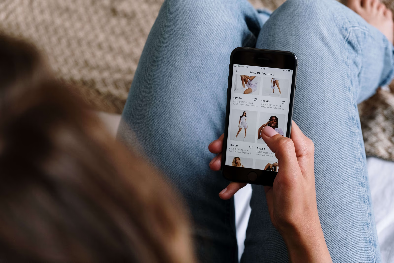
The overwhelming majority of fashion shopping now happens on a phone. People browse clothes in spare moments, on the sofa, on the move, wherever they are, and for most fashion brands the phone is where the great bulk of shoppers meet the brand and decide whether to buy. That makes a fashion mobile website not a scaled-down version of the "real" site but the main event, the primary way most people will ever experience the brand. Designing for mobile first, rather than treating it as an afterthought, is one of the most important things a clothing brand can get right. Here is what that means, and what a great mobile fashion experience needs.
Why mobile comes first in fashion
Fashion is unusually mobile-dominant. Across the industry, the great majority of traffic and shopping happens on phones, more than in many other categories, because browsing clothes is a casual, visual, spare-moment activity that suits a phone perfectly. This means that for most fashion brands, the mobile experience is not one version of the site among several; it is the experience most shoppers will have, full stop.
The implication is significant. A brand that designs primarily for a desktop screen and then squeezes it onto a phone is optimizing for the minority and compromising for the majority. A brand that designs for the phone first, and then adapts upward to larger screens, is building for how people actually shop. In fashion, mobile-first is not a technical nicety; it is designing for reality. There is a further reason mobile matters so much in fashion specifically. Fashion is discovered and browsed casually, often through a phone, in the same spare moments people spend on social media and messaging, so a great deal of fashion shopping is woven into ordinary phone use rather than set aside as a deliberate desktop task. The phone is not just where people happen to shop for clothes; it is where the browsing, discovery, and impulse that drive fashion largely live.
What mobile-first actually means
Mobile-first is often misunderstood as simply making a site technically work on a phone. It means more than that. A site can be technically responsive and still be a poor mobile experience, cramped, fiddly, slow, or awkward, because it was designed for a big screen and merely made to fit a small one. True mobile-first design starts from the phone: it designs the experience, the layout, the browsing, the imagery, the path to purchase, for a small touchscreen from the beginning, so that the mobile experience is genuinely good rather than merely functional.
This shift in starting point changes the result. Designing from the phone up produces an experience that feels natural in the hand, where everything is easy to see, tap, and do on a small screen, rather than a desktop experience a shopper has to fight. For a fashion brand whose shoppers are overwhelmingly on phones, that difference, between a site that feels made for the phone and one merely forced onto it, is much of the difference between converting mobile shoppers and losing them.
Mobile is not just smaller, it is different
Designing for mobile well means understanding that mobile shopping is not simply desktop shopping on a smaller screen; it is a different experience, and shoppers behave differently. Mobile fashion shopping tends to happen in spare, interruptible moments, a few minutes here and there, rather than in long focused sessions, so a mobile site has to make it easy for a shopper to dip in, browse, and pick up where they left off. It is done one-handed, with a thumb, often while doing something else, so everything has to be reachable and effortless without careful two-handed precision.
These behaviours have design consequences. Because mobile sessions are short and interruptible, features that let a shopper save items and return matter more, and a fast, easy experience matters more, since a shopper with only a few minutes will not fight a slow or awkward site. Because shopping is one-handed and casual, simplicity and thumb-friendliness matter more than they might on a desktop a shopper is sitting down to use deliberately. Designing for how people actually shop on phones, in snatched moments, one-handed, easily interrupted, rather than assuming a focused desktop-style session on a smaller screen, is much of what makes a mobile fashion experience genuinely work.
What a great mobile fashion experience needs
Several things matter most for a fashion mobile website.
Speed. Mobile shoppers are impatient and often on slower connections, so a fast-loading site is essential; a slow one loses shoppers before it even appears.
Beautiful imagery on a small screen. Fashion sells on visuals, so the imagery has to look stunning and load well on a phone, conveying the clothes beautifully within the constraints of a small screen. This is a real design challenge, because fashion imagery is often large and detailed, and it has to be delivered so that it both looks superb and loads quickly on a phone, which takes genuine care rather than simply displaying full-size images on a small screen.
Effortless browsing and filtering. Shoppers need to explore and narrow a range easily with their thumbs, so browsing, filtering, and navigating have to be smooth and touch-friendly, not fiddly.
An easy mobile checkout. Buying on a phone has to be simple, with a checkout designed for a small screen and support for fast, familiar mobile payment, so a ready shopper can complete the purchase without frustration. Checkout is where mobile friction is most costly, since a shopper who has decided to buy can still be lost by a checkout that is awkward to complete on a phone, so it repays being designed specifically for the small screen and the mobile shopper.
Thumb-friendly design throughout. Everything a shopper needs to tap should be easy to reach and use one-handed, because that is how people hold their phones.
Where mobile fashion sites commonly fall short
Mobile fashion experiences fail in a few recurring, avoidable ways. The most common is being merely shrunk rather than genuinely designed for mobile, so the site technically fits a phone but feels cramped, fiddly, and awkward to use. Another is slowness, heavy pages that load reluctantly on a phone and a connection, testing the patience of a shopper who has little. Then there are the touch failures, buttons and controls too small or too close to tap reliably, filters and navigation that are frustrating with a thumb, and checkouts that were clearly designed for a keyboard and mouse.
Imagery is another common weak point: photographs that look stunning on a desktop but load slowly or display poorly on a phone, undercutting exactly the visual appeal fashion depends on. Each of these turns the experience most of a brand's shoppers will have into a frustrating one. A mobile experience that is genuinely designed for the phone, fast, touch-friendly, visually strong, and easy to shop one-handed, avoids them, and in doing so serves the majority of shoppers well rather than badly. Since most fashion shoppers are on phones, fixing these mobile shortcomings is often the single highest-impact improvement a fashion brand can make.
The cost of getting it wrong
Because most fashion shoppers are on phones, a poor mobile experience is not a minor flaw affecting a few visitors; it is a failure affecting most of them. A fashion brand with a beautiful desktop site and a mediocre mobile one is delivering its worst experience to the majority of its shoppers, and losing sales accordingly, often without realizing where they are going. Conversely, a brand that gets mobile right is serving the majority well, which for most fashion brands is where growth actually comes from. In a mobile-dominant field, the mobile experience is not one priority among many; it is close to the whole game.
Where to go next
For a fashion brand, the mobile experience is the experience most shoppers will have. For the full picture, see our guide to clothing brand website design and how we approach clothing brand website design, and read on into the features every fashion website needs to convert, building trust on a clothing brand's website, and navigation and UX that keep fashion shoppers browsing.
When you last looked at your own fashion website on a phone, did it feel genuinely made for that screen, fast, beautiful, and effortless to shop, or like a desktop site squeezed onto it?