
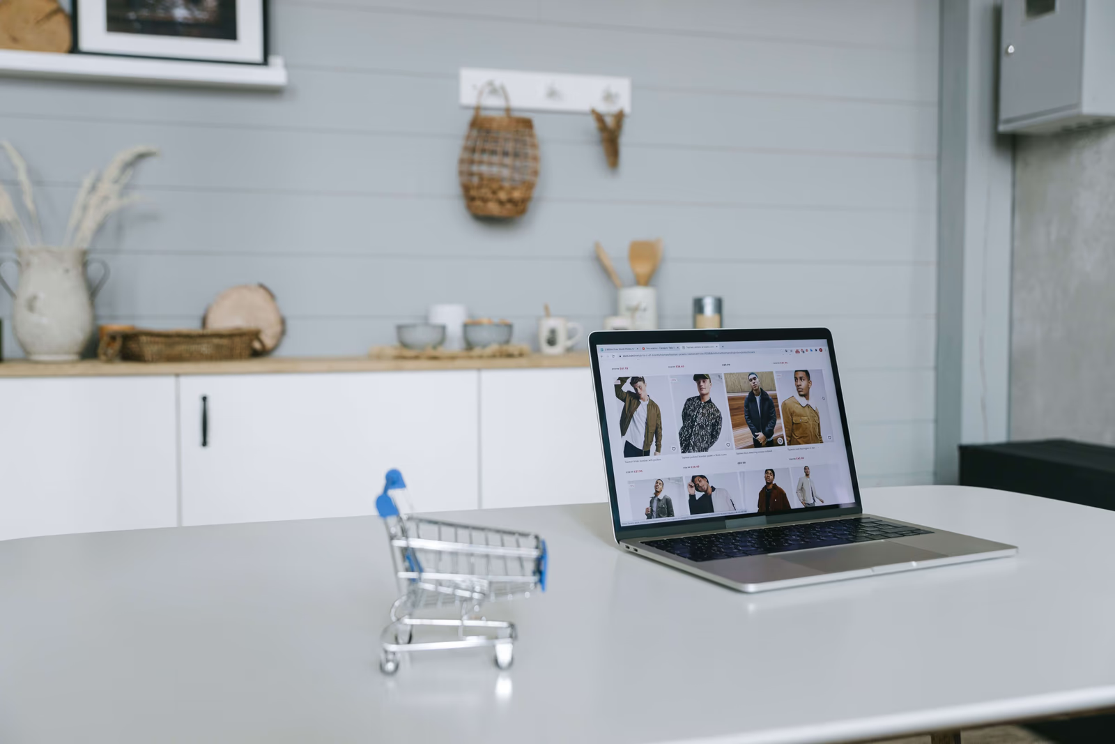
Fashion shopping is exploratory. People come to browse, to discover, to see what catches their eye, often without a specific item in mind, and the longer and more happily they browse, the more likely they are to find something and buy. That makes navigation and user experience central to a fashion website: good UX keeps shoppers exploring and discovering, while poor UX ends the session early, taking the sale with it. Fashion website UX is the craft of making browsing so easy and pleasant that shoppers keep going. Here is how it works.
Why navigation and UX matter so much in fashion
In many kinds of shopping, a customer arrives knowing what they want and simply needs to find and buy it. Fashion is often different: a great deal of fashion shopping is browsing, wandering through a range, discovering items, following interest from one thing to another. This exploratory nature makes the experience of browsing itself decisive. A shopper who finds browsing easy and enjoyable keeps going, sees more, and is more likely to find something they want; a shopper who finds it confusing or frustrating stops, and a stopped shopper does not buy.
So navigation and UX are not just about helping shoppers find a known item; they are about sustaining the exploration that leads to purchases. A fashion site that keeps shoppers happily browsing gives itself far more chances to convert them than one that makes browsing a chore. In a field built on discovery, the quality of the browsing experience is much of what determines whether discovery happens at all. There is a commercial reality underneath this worth naming. A fashion brand invests to bring shoppers to its site, and that investment only pays off if those shoppers stay long enough to find something and buy. Navigation and UX are what determine whether an arriving shopper stays and explores or bounces away within moments, which makes them, quietly, one of the biggest levers on whether all the effort of attracting shoppers turns into sales.
What good fashion UX does
Good fashion website UX tends to share a few qualities.
Intuitive navigation. Shoppers should be able to find their way around effortlessly, understanding how the site is organized and moving through it without confusion. Clear, intuitive navigation lets a shopper explore freely rather than getting lost. Shoppers should rarely have to think about how to get somewhere; the way around the site should feel obvious, so their attention stays on the clothes rather than on figuring out the interface.
Sensible category structure. Clothes organized in a way that matches how shoppers think, by category, occasion, or other natural groupings, helps shoppers find and explore what interests them. A muddled structure leaves shoppers unable to navigate the range.
Easy filtering and refinement. As shoppers browse, letting them easily narrow and refine, by size, colour, style, and more, helps them move from a broad range to items they might actually buy, without friction.
Smooth, easy movement. Browsing should feel fluid, moving between items, categories, and views easily, going back and forth without friction, so exploration is effortless rather than laborious.
Support for discovery. Good fashion UX actively helps shoppers discover more, surfacing related items and making it easy to follow interest, so a shopper who likes one thing is easily led to others. This is where good fashion UX does more than prevent frustration and actively drives sales, turning interest in one item into the discovery of several, which is exactly how exploratory shopping leads to larger, more frequent purchases.
Search, for shoppers who know what they want
While much of fashion shopping is exploratory, not all of it is, and good UX serves both kinds of shopper. Some arrive with a specific item or type in mind, a particular kind of dress, a colour, a category, and want to reach it directly rather than browse. For these shoppers, good site search matters: a search that quickly and accurately surfaces what they are looking for lets them get there fast, while a poor one, returning irrelevant results or missing obvious matches, frustrates them into leaving.
Search and browsing are not rivals but complements, serving different shoppers and different moods. The same person may browse idly one day and search purposefully the next, so a fashion site benefits from doing both well: rich, easy exploration for the browsing shopper, and quick, accurate search for the one who knows what they want. A site that supports only one, forcing browsers to search or searchers to browse, serves half its shoppers poorly. Attending to search alongside browsing ensures that however a shopper prefers to shop, the site helps rather than hinders them, which keeps more of them engaged and moving toward a purchase.
Keeping shoppers browsing
The goal that ties all of this together is keeping shoppers engaged and exploring. Every point of friction, a confusing menu, a hard-to-use filter, an awkward step, is a chance for a shopper to give up, and every smooth, pleasant moment is a reason to keep going. Fashion UX is largely about removing the friction that ends sessions and adding the ease and discovery that sustain them, so that a shopper stays, explores, and finds something to buy.
This matters because, in fashion, browsing time and purchases are closely linked. A shopper who leaves after ten seconds of frustration cannot buy; a shopper who happily explores for ten minutes has many chances to. By keeping shoppers browsing, good navigation and UX quietly create the conditions for sales, which is why they deserve real attention rather than being treated as an afterthought behind the visuals. It is a common mistake to pour effort into a fashion site's visuals while treating navigation and UX as secondary, but the two work together: beautiful visuals draw a shopper in, and good UX keeps them moving through the site long enough for those visuals to do their work. A gorgeous site that is frustrating to navigate squanders its own beauty, losing shoppers before they have seen enough to buy.
Where UX goes wrong
Fashion sites lose browsing shoppers in a few common ways: confusing or cluttered navigation that makes it hard to find or explore; a muddled category structure that does not match how shoppers think; filters that are missing, limited, or awkward to use; and clumsy, high-friction movement that makes browsing feel like work. Each cuts short the exploration that leads to purchases. A site with clear navigation, sensible structure, easy filtering, and smooth, discovery-friendly browsing avoids them, keeping shoppers engaged long enough to buy. The through-line in all these failures is friction: anything that makes exploring harder than it should be. Removing friction, wherever it hides, is much of the work of good fashion UX.
Where to go next
Good navigation and UX keep fashion shoppers browsing long enough to buy. For the full picture, see our guide to clothing brand website design and how we approach clothing brand website design, and read on into the features every fashion website needs to convert, mobile-first fashion websites, and building trust on a clothing brand's website.
Does your website make browsing your clothes so easy and enjoyable that shoppers keep exploring, or does some friction in the navigation quietly end their visit before they find something to buy?