
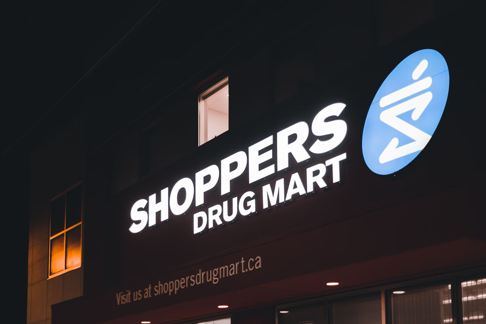
A logo is a small thing that does a large job. It is the most visible mark of your brand, the symbol patients recognize on your sign, your website, your bags, and your paperwork, and often one of the very first ways they judge whether your pharmacy seems trustworthy and professional. A good pharmacy logo works quietly in your favour at every one of those moments. A poor one works against you just as quietly. This is not a guide to designing one yourself, which is skilled work, but a guide to what makes pharmacy logo design succeed, so you can recognize a logo that serves your pharmacy well.
What a pharmacy logo needs to do
A pharmacy logo has a few jobs, and the best ones do all of them at once. It needs to convey trust and professionalism, so a patient seeing it feels they are dealing with a credible healthcare provider. It needs to feel appropriate to a pharmacy, connected to health, care, and community rather than to some unrelated industry. It needs to be simple and versatile enough to work everywhere your pharmacy appears, at any size. And it needs to be distinct enough to be recognized and remembered as yours. A logo that manages all of this becomes a genuine asset; one that manages none of it is just a picture.
Conveying trust and care
Because a pharmacy is a healthcare provider, the single most important quality of its logo is that it feels trustworthy. A patient is making a decision about their health, and the logo is part of the first impression that tells them whether you can be relied upon. A clean, professional, considered logo conveys competence and care. A gimmicky, cheap, or careless one quietly undermines confidence in exactly the place a pharmacy needs it most.
This does not mean a pharmacy logo has to be cold or clinical, and the best ones are not. They convey warmth and care alongside professionalism, because patients want a pharmacy that is both capable and genuinely looks after them. The balance to strike is trustworthy and human at once, credible enough to reassure, warm enough to feel welcoming. A logo that leans too far toward sterile feels impersonal, while one that leans too far toward casual can undercut the sense of a serious healthcare provider. Getting that balance right is much of the craft.
Simplicity and versatility
A logo has to work in a great many places, and a pharmacy's works especially hard: on a large exterior sign, on a website, on a phone screen, on packaging and labels, on printed materials, sometimes shrunk down to a tiny icon. A logo that looks good only at one size, or only in one setting, fails at this. The most effective logos are simple and clean enough to remain clear and recognizable everywhere, from a storefront sign to a favicon.
This is why simplicity is such a virtue in logo design, and why overly complex or fussy logos tend to disappoint. A busy logo crammed with detail may look impressive on a designer's screen and then turn into an unreadable smudge on a sign or a phone. Simplicity is not a lack of creativity; it is what lets a logo work reliably across everything a pharmacy needs it to do.
Being distinct
Pharmacy logos have a tendency to look alike, leaning on the same tired handful of symbols, a generic cross, a stock mortar and pestle, a green swoosh, so that many blur together into an indistinguishable sameness. A logo that falls into this pattern may look acceptable, but it does little to make your pharmacy recognizable or memorable, because it looks like every other pharmacy.
A logo that works is distinct enough to be recognized as yours, standing apart from the generic pharmacy look while still feeling appropriate. This does not require being outlandish, which would undercut trust, but it does require genuine thought about what makes your pharmacy particular and how to express that in a mark that is unmistakably yours. Distinctiveness and appropriateness together are what turn a logo from generic wallpaper into a genuine emblem of your pharmacy.
A logo works with everything else
It helps to keep a logo in perspective. As important as it is, a logo is one element of your brand, not the whole of it, and it works best in concert with the rest: your colours, your visual style, your voice, and the experience you deliver. A strong logo on a pharmacy whose website is a mess, or whose brand is otherwise incoherent, cannot do its job alone. The logo sets a first impression that the rest of the brand then either reinforces or undermines.
This is worth remembering because it guards against two mistakes: pouring all your attention into the logo while neglecting everything else, and, conversely, dismissing the logo as unimportant because it is only one piece. Neither is right. The logo is a small but pivotal part of a larger whole, and it earns its keep when it is designed to sit naturally within a coherent brand rather than in isolation from it.
What to avoid
A few things reliably weaken a pharmacy logo. Clip-art or template symbols make a pharmacy look generic and cheap. Overly complex designs fail to work at small sizes and on signage. A dated look suggests a pharmacy that has not kept up. Trying too hard, with gimmicks or trend-chasing, undercuts the trust a pharmacy logo most needs to convey. And a logo that could belong to any business, with nothing connecting it to a pharmacy or to yours in particular, is a missed opportunity. The common thread is that each of these erodes either trust or recognition, the two things a pharmacy logo exists to build.
Why it is worth doing well
A logo is a small investment that shapes a great deal, because it represents your entire brand and appears everywhere. A professionally designed logo that genuinely works, trustworthy, appropriate, versatile, and distinct, pays for itself many times over in the confidence it builds and the recognition it earns. A cheap or careless one, by contrast, quietly costs you in every place it appears. This is one of those areas where the difference between doing it properly and doing it cheaply is felt for years, which is why it is worth having your logo designed well by someone who understands both design and what a pharmacy needs it to convey, rather than assembled quickly from a template. The logo is often the first handshake between your pharmacy and a patient, and it pays to make that handshake a confident one.
Refreshing a logo that has aged
Many established pharmacies carry a logo that has quietly aged, one that served well for years but now looks dated, or was never quite right to begin with. The question of whether and how to update it deserves care, because a logo also carries whatever recognition and goodwill patients have built up with it, and that is not to be thrown away lightly.
The usual answer is not to discard a familiar logo overnight, which can disorient loyal patients, but to consider a thoughtful refresh: modernizing and strengthening the mark while keeping enough continuity that patients still recognize it as yours. A good refresh preserves the equity in an existing logo, the recognition patients already have, while fixing what no longer works, so the pharmacy feels current without feeling like a stranger. When a logo is genuinely beyond saving, a fuller redesign may be warranted, but even then it is worth handling the transition deliberately so patients are brought along rather than confused. The judgment of how far to go is one an experienced designer can help with, weighing recognition against the need to feel current.
Where to go next
A logo is the most visible mark of a pharmacy's brand, and worth getting right. For the full picture, see our guide to pharmacy branding and how we approach pharmacy web design, and read on into telling your pharmacy's story, keeping your pharmacy brand consistent everywhere, and the colours and visuals that make a pharmacy feel trustworthy.
Look at your pharmacy's logo on your phone, on your sign, and shrunk to a tiny icon: does it stay clear and recognizable, and does it still feel like a pharmacy patients can trust?