
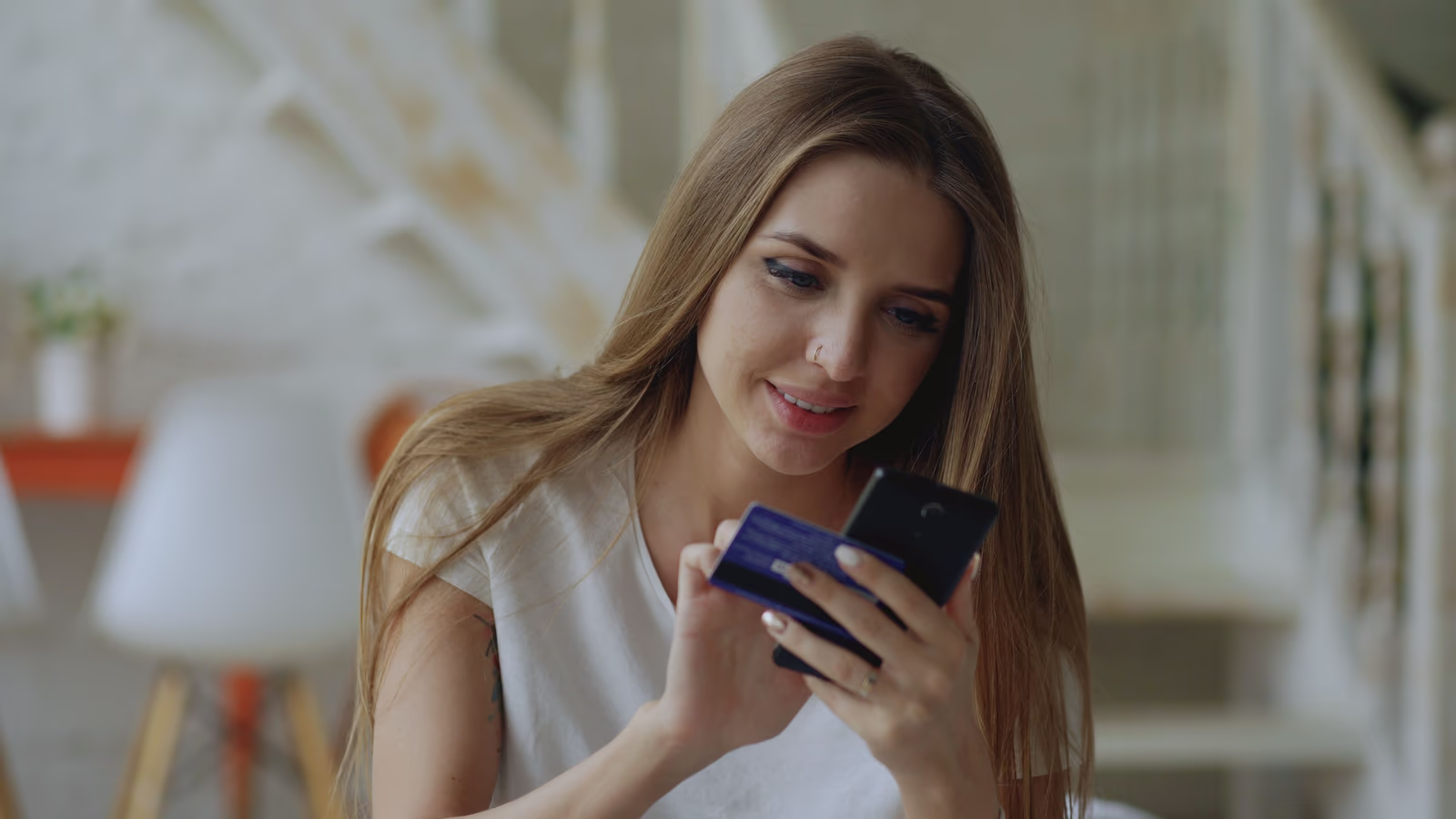
A beauty store can have a beautiful brand, gorgeous product pages, and a shopper ready to buy, and still lose the sale at the last step, if the checkout gets in the way. The checkout is where interest becomes a purchase or evaporates, and for beauty it carries a particular urgency, because beauty purchases are often quick and somewhat emotional, and friction at the wrong moment can cool an impulse before it becomes an order. Good beauty checkout design is the work of making that final step so smooth that a ready shopper simply completes the purchase. Here is what that takes.
Why checkout matters so much for beauty
In any online store, the checkout is where hesitation peaks and abandonment happens, because it is where a shopper hands over money and details. For beauty, two things sharpen this. First, beauty purchases are frequently impulsive or emotional, a shopper is drawn to a product, wants it, and is ready to buy in the moment, and any friction that slows that moment gives the impulse time to fade. Second, the purchases are often relatively small, so a shopper has little tolerance for a checkout that asks too much; the effort of a laborious checkout can easily outweigh the modest commitment of the purchase, and they abandon it. There is a compounding cost to this that is easy to miss. A beauty brand often spends real effort and money attracting a shopper and making them want a product, so a sale lost at checkout is not just one missed purchase but the waste of everything invested in getting the shopper that far. The checkout is the narrowest point in the whole funnel, and losses there are the most expensive losses a store suffers, because they come after all the hard work is already done.
This makes the checkout one of the highest-return parts of a beauty store to get right. A brand that has done the hard work of attracting a shopper and making them want a product should not lose that shopper to a checkout that asks too much or works poorly. Making checkout effortless is, in effect, protecting every sale the rest of the store has earned.
What a good beauty checkout does
A checkout that converts beauty shoppers tends to share a few qualities.
It is short and simple. Every extra step and unnecessary field sheds a few more shoppers. A good checkout asks only for what is genuinely needed and makes the path from cart to completed purchase as short and clear as possible, which matters especially for the quick, small purchases beauty often involves.
It does not force account creation. Requiring a shopper to create an account before buying turns a simple purchase into a commitment many will decline. Letting shoppers check out as guests, with the option to create an account, keeps far more of them.
It reassures on trust and security. Even for a small purchase, a shopper wants to feel their payment and details are safe. A checkout that conveys security and professionalism lets a shopper complete the purchase with confidence, while anything that feels off at the moment of payment loses them.
It is clear about costs. Unexpected costs appearing at the final step, shipping or fees a shopper did not anticipate, are among the most common reasons purchases are abandoned. A trustworthy checkout is transparent about the total before the shopper reaches the final step.
It works flawlessly on a phone, with easy payment. Since most beauty shopping happens on a phone, the checkout has to be effortless on a small screen, and supporting fast, familiar payment options, including mobile wallets, removes friction at exactly the moment it matters most.
Where beauty checkouts commonly go wrong
It helps to know the ways checkouts most often lose beauty shoppers, because they are consistent and avoidable. The most common is sheer length, a checkout stretched across too many steps or asking for too much, which tests the patience of a shopper making a small, quick purchase until they abandon it. Close behind is forced account creation, which turns an impulse buy into a commitment many shoppers decline. Then there are surprise costs at the final step, shipping or fees that appear only at the end and feel like a small betrayal, sending shoppers away. And there is any sense of insecurity or unprofessionalism at the moment of payment, which for beauty, where the purchase is often modest and the shopper easily deterred, is enough to lose the sale.
Each of these is within a brand's control to fix, and fixing them recovers sales lost at the finish line. The pattern behind them all is a checkout built around the store's convenience rather than the shopper's, extra steps, forced sign-ups, hidden costs, all serving the business rather than the customer. A checkout built the other way, genuinely for the shopper's ease, avoids these failures almost by default, which matters all the more for the quick, easily-interrupted purchases beauty so often involves.
The cart, and the moment before checkout
The checkout does not begin at the payment page; it begins in the cart, and the cart is worth attention too. A clear, simple cart that lets a shopper easily see what they are buying, adjust quantities, and proceed keeps momentum toward the purchase, while a confusing or awkward cart introduces friction before the checkout even starts. For beauty, where a shopper may be adding a small product on impulse, the cart should make continuing to purchase the easy, obvious next step.
The cart is also where a brand can, gently, encourage a shopper to add a little more, a complementary product, a way to reach free shipping, so long as it is genuinely helpful rather than pushy. Beauty shoppers often welcome a relevant suggestion, but resent being pressured, so the line to respect is between helpfully surfacing something a shopper might want and cluttering the path to purchase with distractions. Handled well, the cart both preserves the momentum toward checkout and, where appropriate, gently increases the order, without ever getting in the way of a shopper who simply wants to buy what they came for and be done.
The impulse and the emotion
It is worth designing specifically for the emotional, in-the-moment nature of much beauty buying. A shopper who has just fallen for a product is in a particular state: they want it, they are ready, and they are vulnerable to being talked out of it by any obstacle. A checkout that carries them smoothly from that moment of desire to a completed order captures the sale while the feeling is fresh. One that interrupts it, with hurdles, demands, or friction, gives the shopper time to reconsider, get distracted, or simply give up.
This does not mean manipulating shoppers; it means not sabotaging a genuine desire to buy with an unnecessarily difficult process. The goal is simply to let a shopper who wants a product get it, easily, before the ordinary frictions of a clumsy checkout cool their enthusiasm. For beauty, where so much buying is emotional and immediate, a checkout that respects and preserves that momentum is worth real care, because the sales it protects are ones that were genuinely ready to happen. It is also worth remembering that a smooth first purchase is the start of a relationship, not just a transaction. In beauty, where repeat buying is where the real value lies, a shopper's first checkout experience colours how they feel about the brand: a smooth, reassuring one invites them back, while a frustrating one can sour the relationship before it begins, even if the product itself is excellent. Getting the checkout right is therefore not only about this sale but about every sale that could follow it.
Reducing the abandonment that loses sales
Most beauty checkouts lose shoppers not to one fatal flaw but to accumulated friction and doubt: a step too many, a forced account, a surprise cost, a form awkward on a phone, a flicker of uncertainty about security. Each sheds a few more sales at the very last stage. The discipline that keeps shoppers is to remove every unnecessary step, offer guest checkout, be transparent about costs, reassure at the point of payment, and make the whole thing effortless on any device. For a beauty brand, the payoff is not only completed sales but the beginning of a customer relationship, because a shopper whose first purchase was smooth and reassuring comes back more readily than one whose first checkout was a struggle. Because so much of a beauty store's value is in repeat custom, this makes checkout quality doubly worth the investment: it wins the immediate sale and helps secure the customer, whereas a poor checkout loses both at once. Few improvements to a beauty store pay back as directly, or as twice-over, as making the checkout genuinely effortless.
Where to go next
An effortless checkout protects every beauty sale the rest of the store has earned. For the full picture, see our guide to beauty e-commerce and how we approach beauty e-commerce, and read on into product pages that sell skincare and cosmetics and personalized beauty shopping with recommendations and quizzes.
When did you last go through your own store's checkout on a phone, and did it carry you smoothly from wanting a product to owning it, or did some part of it give you a reason to stop?